Nowadays, organizations can’t afford to ship software with a terrible end-user experience. Doing so is begging for your current customers to become former customers, since the competition is just a few clicks away.
In today’s post, we’ll give you seven practical tips you can adopt right away to improve the end-user experience of your sites and apps so your customers remain your customers.
What Is End-User Experience?
Before we walk you through our list of best practices, we must ensure we’re on the same page when it comes to the definition of end-user experience. So what’s this thing all about?
End-user experience refers to the “end users’ emotions and behavior while interacting with your application.” You want users to feel good about using your app. You want it to be a positive—maybe even memorable—experience, rather than a neutral or terrible one.
Why End-User Experience Matters
Do your users feel frustrated when using your application? Do your app’s design choices leave users astonished or confused? If so, this means they’re using your app, on average, for less time. They’re also less likely to purchase from your site while they’re using it, and they most likely won’t come back.
If, on the other hand, users pick adjectives such as easy, straightforward, simple, or even fun to describe working with your application, you’re golden. They’re likely to use your app for more time, come back more often, and buy your services or products.
In other words, offering a poor end-user experience is a surefire way to prevent you from getting new users, annoy—and probably lose—the ones you have, and lose a lot of money in the process.
How to Improve End-User Experience: 7 Practical Tips
Enough with definitions. Let’s walk you through our list of tips you can adopt right away to significantly improve the end-user experience of your apps.
#1 Improve Your Site’s Performance
Performance matters, and it matters more with each passing year. It’s long been known how poor performance affects conversion rates. This is hardly surprising, considering a large portion of users say a page should load in less than two seconds.
Additionally, Google punishes slow sites. The search mechanism uses performance as one of the contributing factors when evaluating your app’s page experience, which is one of the many signals Google uses to calculate page rank.
So how do you improve your app’s performance? There are three main areas you can focus on: back-end code, client-side code, and the database. Each one requires a lot of knowledge, so you should start studying them soon.
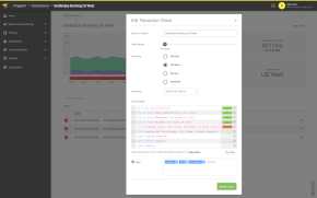
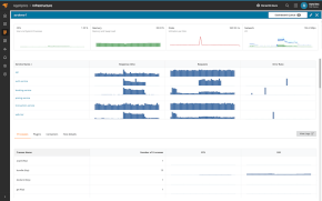
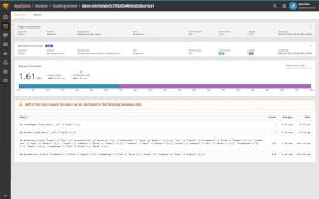
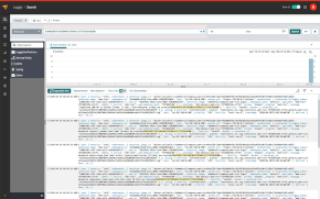
Leveraging a great tool doesn’t hurt. Adopting a comprehensive website performance and availability monitoring tool such as SolarWinds® Pingdom® can help you stay on top of problems, detecting and fixing issues before they affect end-user experience.
#2 Remain Consistent
A lack of consistency in your app will give users an impression of amateurism or lack of care. Even worse, it’ll make using the app harder, leaving your users confused or frustrated.
Consistency starts with formatting choices. Things like font types and sizes have to be consistent across the whole app, as do color schemes, icons, and the styling applied to elements such as buttons.
But consistency goes far beyond cosmetic choices. Language has to be consistent as well. For instance, let’s say your app allows users to create a project by copying an existing one. Choose a name for this operation and remain consistent. Don’t call it “cloning” on one screen and then “duplicating” on another.
#3 Don’t Disregard Accessibility
Many developers think accessibility only refers to making an app accessible for blind or vision-impaired users. Accessibility does cater to the needs of these users, but it involves a lot more than this.
For instance, some users might have trouble using a mouse or other pointing devices. Such difficulty might be permanent—in the case of disability—but it can also be temporary. For instance, think of someone who broke their dominant arm and has to use the mouse with the other hand for a few weeks. It makes sense to increase the clickable area of buttons—radio buttons and other clickable elements—to improve the lives of these users.
This is just one example. The bottom line is this: take some time to learn about accessibility and how to improve. Adopting basic accessibility practices isn’t difficult and goes a long way in improving the lives of those who need them.
#4 Take Care of Link Formatting
If your website has links that don’t look like obvious links, it can result in lost leads. The opposite is also a problem: having text that isn’t a link but looks like one. This will cause confusion and frustration in the user, who might feel cheated or fooled.
Do some research about hyperlink usability. Beyond the above factors to consider, colors are of paramount importance. Take into account color-blind users and ensure visited links have a different color than unvisited ones to make navigation easier.
Font size is also essential for links. Besides the accessibility issues we’ve mentioned, small font sizes for hyperlinks might make it hard for mobile users to tap on them.
#5 Make Clickable Elements Obvious
Clickable elements should be easily identifiable as such. This includes not only links but buttons, suspended lists, checkboxes, and draggable elements. Interactive elements should invite the user to play with them.
When the application doesn’t give you clear signs of what to do next, it’s akin to being stuck in a particularly puzzling stage of a video game, one where you have to look for help after feeling helpless for too long. Such a challenge might be acceptable for a game, but it’s not acceptable for an application.
#6 Learn How to Write for the Web
This tip isn’t just about readability, though it certainly plays a role. We’re more concerned about legibility. How can you make your copy easier to follow and understand?
The answer is simple: you have to learn how to write for the web. This includes understanding—and embracing—the fact that most readers don’t actually read webpages.
They skim.
Writing effectively for the web means writing text readers can easily skim. This means avoiding huge walls of text and using elements like bulleted or numbered lists, images, or even quotes to break the text into chunks. Other tips include the following:
- Avoid passive voice, since it makes your text slightly harder to understand
- Focus on shortening sentences and paragraphs
- Use pronouns like “you” and “we” to make the text feel more personal
Of course, these are just a handful of strategies. Writing for the web is a broad topic, but if you learn and apply at least the basic tenets, it’s probably enough to provide a better experience for your end users.
#7 Be Aware of Cultural Differences
Names don’t work the same way across all countries and cultures. The same goes for addresses and many other things. Don’t even get me started on the messiness of time zones, date and time formats, etc.
You have to take these differences into account when designing your applications, especially when it comes to web apps that are easily available to the entire world. Otherwise, you run the risk of creating a hard—or even impossible—to use app for millions or billions of people all over the planet.
End-User Experience: It Doesn’t Have to Be Rocket Science
Software organizations live in a very competitive world. It’s hard to stay afloat, especially when the competition is so fierce. Offering your users a terrible experience is a sure way to help your competitors.
Improving end-user experience may feel like a Herculean task. We get it. Accessibility or application performance, for instance, are huge fields you can spend your whole career studying.
Here’s the trick, though: end-user experience can be super hard, but it doesn’t have to be. As you’ve seen in this post, learning and applying the basic best practices isn’t difficult and can net you disproportionately good results.
Make sure you look at existing tools designed to make your life better. A platform like Pingdom can offer you monitoring capabilities capable of taking your end-user experience approach to the next level. We invite you to try Pingdom today.
This post was written by Carlos Schults. Carlos is a .NET software developer with experience in both desktop and web development, and he’s now trying his hand at mobile. He has a passion for writing clean and concise code, and he’s interested in practices capable of helping you improve app health, such as code review, automated testing, and continuous build.
