 Google Chrome is a great web browser. It has a super-fast Javascript engine, it renders pages with the standards-friendly Webkit, it’s minimalistic and easy to use. It’s also been developed at a breakneck pace, reaching version 6 (!) in little more than two years. With Chrome, Google has really pushed the envelope in terms of speed and stability.
But Chrome has one huge disadvantage compared to basically every other browser out there: Really, REALLY awkward bookmark handling. And this is completely unnecessary.
Let us explain… and propose a solution.
The problem
Not everyone uses bookmarks (a.k.a. favorites) a lot, but many do, and through the years a certain set of “best practices” have been developed by browser makers and users alike, specifically the ability to have a bookmarks sidebar that can be used for viewing, adding and opening bookmarks in a simple fashion.
Chrome almost has this, but has somehow completely missed the target.
Open the “bookmark manager” in Chrome and you’ll be met by something like what you see here below. That’s the closest thing to a sidebar you get, but as you can see it monopolizes an entire tab. There simply is no sidebar.

Chrome also has a bookmarks bar, seen in the screenshot above, but that’s simply not good enough, especially if you have your bookmarks in a tree structure (or have a lot of them). It’s impossible to get a decent overview of your bookmarks this way, and there are other usability issues, like having to wade through the directory structure for every single bookmark you want to open.
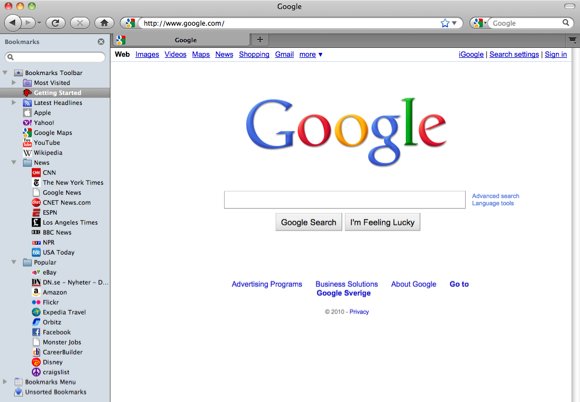
Why a sidebar? With a proper bookmarks sidebar, users would be able to have it visible all the time if they so pleased, easily adding bookmarks by dragging and dropping tabs to the right place in the sidebar. Not to mention the great overview of and easy access to bookmarks this provides.
This lack of a bookmarks sidebar simply makes Chrome less useful, and for many people it’s a dealbreaker.
What we propose
Google, we love that you’re innovating and pushing the envelope with Chrome. However, in this specific case, your solution for handling bookmarks is inferior to that of your competitors. It simply is less useful, not to mention clumsier. It doesn’t have to be this way.
Our modest suggestion: Look at how the bookmarks sidebar in Firefox works. You can probably tweak it and improve it and make it your own, but it’s a great starting point for how to do this “right.”

Whatever you do, add a proper bookmark sidebar that actually lets users browse with the sidebar visible, and let them easily open and add bookmarks (with drag and drop).
We have lost count of how many times we’ve heard people say that the ONLY thing preventing them from switching to Chrome is its lack of a proper bookmarks sidebar.
And it’s not just us. Frustrated users have been raising this issue in various forums for Chrome for quite some time now, seemingly with no response at all from Google.
Final words
Bookmarks are a fundamental concept to web browsers and not having the best possible support for them is a handicap. Since there are already good practices in place for how to handle bookmarks, no browser maker should need to worry too much about how to handle them.
We don’t mind innovation (in fact, we love it), but in this case Google has made something much worse than it needs to be. And with Chrome at version 6, it’s quite frankly a bit baffling to us why this has not yet been addressed. It should be in Google’s best interest to fix this, and we are convinced it would make even more people switch to Chrome as their primary web browser.
Agree? Disagree? Please feel free to add your opinion in the comments.


