As we enter 2021, we’re seeing a renewed focus on user experience (UX). Whereas user experience was first limited to a UX designer, it encompasses so much more nowadays.
User experience has become a business mentality, where everyone in a company can make a positive contribution to user experience. Some examples include the following:
- Use a consistent and inclusive voice for all sorts of communication (marketing)
- Improve page loading time for product pages (web dev)
- Reward users for their actions (UI/UX design)
This article explores different tips to boost your e-commerce website’s user experience. Let’s discuss the following items:
- Consistency
- Synthetic transaction monitoring
- Real user monitoring
- CacheStorage API
- AMP technology
- Vector images (SVG)
1. Consistency
Consistency is one of the cornerstone elements of improving a website’s user experience. A consistent design forms the basis of an intuitive design. Consistency breeds familiarity—allowing users to quickly learn a new interface by recognizing familiar elements. By keeping these elements consistent, we can further improve the learning process.
According to editor and business writer Howard Walwyn, “Inconsistency risks distracting your reader, by interrupting their cognitive process when they see something unexpected. If you use one punctuation approach, or formatting style, or spelling early in your piece, but subsequently use a completely different one (even if valid), the reader’s brain will pick this up, unconsciously or consciously.” Although Walwyn may be looking specifically at written content here, the same concept applies to website design and layout.
Let’s focus on e-commerce. Webshops should stick to a standard layout for product pages. We want our user to focus their attention on the product instead of learning about a new interface.
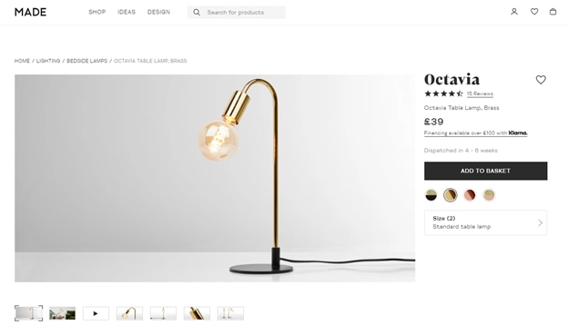
For instance, Made.com provides an excellent example of how to structure a product page. First, we expect an image gallery to view product pictures on the left side.
Furthermore, users expect a product description, reviews, and more detailed product information such as pricing data, with a call-to-action button to add items to your shopping cart. We expect to locate this type of information on the right side of the page.
Another example includes the placement of the checkout and profile buttons. By default, we should place buttons at the top right corner.
Avoid experimenting with alternative design strategies for common e-commerce elements. It often confuses users and distracts them from their shopping task.
In short, be consistent with elements related to your e-commerce business—customer messaging, newsletters, blogs, tone of voice, etc. Humans love consistency. It allows us to focus on our core tasks.
Tip: Make use of Google’s Material Design library, which Google developed to create a consistent visual language for their products.
2. Synthetic Transaction Monitoring to Detect Downtime and Performance Issues
The success of an e-commerce website heavily depends on its availability. A website that’s down 20% of the time will perform badly in terms of sales. However, even small delays have a significant impact on the website’s success.
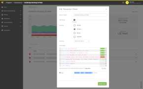
Synthetic transaction monitoring is a kind of monitoring that simulates end users and alerts you when an issue is discovered. Issues can include the site being down, and failures in a transaction step, for example adding items to the shopping cart, completing the checkout process, or loading a high-quality product image. It also helps you evaluate if a slow-performing component starts with your application or a third-party app.
Therefore, synthetic transaction monitoring adds the following two benefits:
- Detect slow-performing or failed site components
- Detect downtime in real time, so you can quickly react and fix the problem
Synthetic transaction monitoring is an excellent strategy to guarantee performance and availability for your e-commerce website. According to Nielsen Norman Group, leaders in research-based user experience, “0.1 second is about the limit for having the user feel that the system is reacting instantaneously.” They also found that a delay of up to 1.0 second is the limit for the user’s flow of thoughts to stay uninterrupted—another reason why it’s critical to proactively monitor your website’s performance.
3. Real-Time User Experience Monitoring With Real User Monitoring
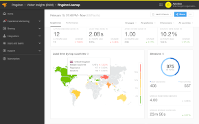
In contrast to synthetic monitoring, real user monitoring (RUM) gathers insights into the end-user experience based on actual site visitors. This allows you to validate page loading time in real time for users across the world.
RUM measures the page loading time for different types of users based on geography, browser and device used. Let’s say it takes 0.3 seconds for your product page to load for European users. However, RUM exposes that South American users experience a much slower loading time of 1.2 seconds.
We can solve the above problem by using servers closer to our users or using a content delivery network (CDN). A CDN offers servers across the globe to quickly deliver your content to each geographical region. Without a CDN, content served from a server in Amsterdam, for example, has to travel a long way to reach a South American user.
Tip: Use RUM to monitor and analyze page speed across the world in real time.
4. Make Use of the CacheStorage API
The browser’s CacheStorage API lets you cache requests and their responses. This approach is particularly useful to cache product images or complete product pages. It improves the website loading time for two scenarios:
- When a user returns to a previous page, the browser doesn’t have to re-request the page but can directly load it from the local browser cache
- When a user returns at a later point to a product page, which frequently happens when using retargeting techniques, the website will load much faster as there’s a big chance the particular page is still accessible in the cache
This strategy won’t improve the first time a user loads a particular product page. This strategy only works when loading a page for the second time if the page hasn’t changed by then.
Recommended reading: A more technical guide to using the CacheStorage API methods.
5. Embrace AMP to Boost Page Load Time
Accelerated Mobile Pages (AMP) was developed and has been favored by Google to build lightweight mobile experiences. The technology simplifies HTML and CSS rules to keep everything as simple as possible. As a result, the page loading time for the mobile version of your page will increase drastically.
Initially, blogs employed this technology to improve loading time. However, you can now use AMP technology for building interactive product pages often requiring a dynamic product configuration.
Google now offers amp-bind, which allows you to store a page-based state for the users to interact with, such as changing the product color or displaying the available stock.
As an added benefit, Google favors pages using AMP technology. You’ll likely receive more organic visitors for the mobile version of your product pages.
Tip: Check out the SolarWinds® Pingdom® page speed monitoring tool to benchmark results and further improve page loading time.
6. Use Vector Images (SVG) Over Traditional Image Formats (JPEG, PNG, GIF)
It’s much faster to load a vector image (SVG) as part of your HTML code. To load traditional image formats, such as JPEG, PNG, or GIF, we send a request to the server to load each image.
An SVG image can look like this in your HTML code. The following snippet renders a simple dark blue square with a black border. Luckily, we can craft much more complex SVG images.
html
<svg height=”100” width=”100”>
<rect width=”100” height=”100” style=”fill:rgb(0,0,255);stroke-width:3;stroke:rgb(0,0,0)”></rect>
</svg>
Vector images work best for icons or other more primitive shapes created by drawable vector software like Adobe Illustrator. It’s not possible to convert product images to vector images.
Still, if your website loads on average ten icons per page, you can save ten requests to your server. On top of that, vector images allow for endless zooming as the quality always remains the same. This property is more useful for loading images for different devices as a vector image can adapt itself to the page layout. For example, it can scale down for a mobile page and enlarge for a desktop user.
A Note About UX in E-Commerce
As an e-commerce owner, you can optimize UX in many aspects of your website: layout, functionality, consistency, messaging, etc. It’s not an easy task to optimize all these elements and find the right UX balance. While user experience isn’t limited to page loading time, it’s still one of the critical elements that can affect engagement and conversions. As we all know, a slow website distracts and frustrates the user.
We encourage you to explore the various techniques discussed above to improve page loading time either with AMP technology, vector images, CacheStorage API, real user monitoring, or synthetic transaction monitoring.
Have fun experimenting with user experience!
This post was written by Michiel Mulders. Michiel is a passionate blockchain developer who loves writing technical content. Besides that, he loves learning about marketing, UX psychology, and entrepreneurship. When he’s not writing, he’s probably enjoying a Belgian beer!
