The top 100 websites in the US count their visitor numbers in the millions. They need to care about every aspect of their website to handle (and take advantage of) all that traffic, which includes handling those users who sometimes end up on non-existing pages either by accident or because of an error. This means providing a helpful 404 error page.
Curious about how the big players on the web were handling this, we tested the 404 error pages for all the top 100 websites in the US (according to Alexa.com) and found that almost one in four had an inadequate 404 error page. Sinners include Google, Match.com, YouTube, Blogger, Megaupload and many more.
Why should the site owners care about 404 error pages?
Whenever you try to access a page that doesn’t exist on a website, you get a 404 error. Some possible ways the end user can end up on a 404 error page include:
- Types in the wrong URL.
- Follows an old link to a page that no longer exists.
- Follows a broken link, for example a broken link in an email.
- The webmaster has accidentally removed a page.
For the site owners, every 404 error is a potentially lost visitor and loss of exposure, so it is important to make the most of these pages and not settle for a default, generic 404 error page that will not tell the visitor anything at all about your site.
Two simple criteria for a helpful 404 page
For the end user, landing on 404 pages is quite common. Once you do end up on a 404 page, it really helps if it:
- Clearly lets you know who the 404 page belongs to.
- Has a link to the home page, and even better, has additional navigation help.
From the site owner’s point of view, this makes perfect sense. Someone using your site is lost. Help that person!
Testing the US top 100 websites
We believe that the two criteria we stated above are the two basic things that any 404 error page should do. However, based on these criteria, 23 of the US top 100 websites have inadequate 404 error pages.
| Alexa ranking | Site (click for 404) | Logo/clear identification | Link to home or navigation help |
|---|---|---|---|
| 1 | google.com | yes | no |
| 4 | youtube.com | no | no |
| 12 | blogger.com | no | no |
| 15 | megaupload.com | no | no |
| 16 | megarotic.com | no | no |
| 23 | rapidshare.com | no | no |
| 25 | livejournal.com | no | yes |
| 44 | megavideo.com | no | no |
| 48 | imageshack.us | no | no |
| 53 | gaiaonline.com | no | no |
| 54 | statcounter.com | no | no |
| 59 | zedo.com | no | no |
| 62 | hi5.com | no | no |
| 63 | mininova.org | no | yes |
| 64 | digitalpoint.com | no | no |
| 66 | vnexpress.net | no | no |
| 75 | invisionfree.com | no | no |
| 76 | worldofwarcraft.com | no | no |
| 80 | att.net | no | no |
| 85 | pogo.com | no | yes |
| 89 | vietfun.com | no | yes |
| 94 | match.com | no | no |
| 96 | usercash.com | no | no |
The really bad
17 of the top 100 websites use completely generic 404 error pages that don’t tell the user anything about the website; the visitor could have ended up anywhere. Examples include YouTube, Blogger, Megaupload, ImageShack and the World of Warcraft website. They all failed on both the criteria we set up for this test.
And then there is Match.com, which deserves a special mention. Match.com doesn’t even deliver a generic 404 error page. You are simply met by a blank, white page with no text, no images, no links and no information whatsoever.

Considering the amount of money that Match.com spends on marketing, we think that they could use the hits to their 404 page a bit better, both for their own sake, and for the confused users who land on this page not knowing if Match.com is down or what is happening.
Better, but not good enough
The five remaining websites that failed the test missed one of the two criteria, which is better, but still inadequate.
For example, LiveJournal would have a good 404 error page if it wasn’t for the fact that the only way to figure out that you have landed on a LiveJournal page is to read the small text in the links at the bottom. A logo or other clear identification would have kept them out of this list.
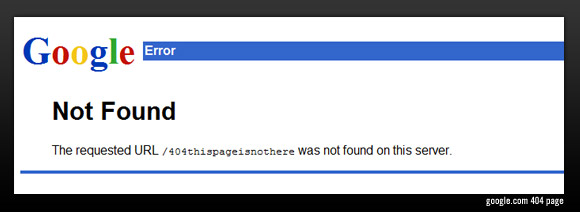
Google, on the other hand, clearly shows the visitor that he/she has landed on a Google page, but has no links or other navigation help. It’s Google, why not include a search field?
Really good
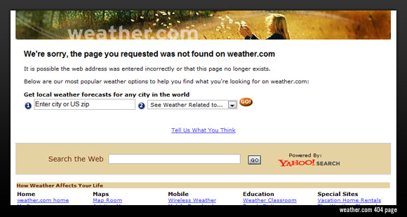
As we already stated, these top-ranked websites have millions and millions of visitors, and you need to handle every one of them in a good way, including the ones who end up on the wrong page. To give a good example of how helpful and clear a 404 error page can be, look no further than Weather.com.
Steps for a better 404 page
The Weather.com example above is an excellent and really helpful 404 error page. We have extracted the good points:
- Even though that specific page is not available, the visitor clearly knows what website he/she is visiting thanks to the Weather.com banner at the top.
- They explain that the page the user tried accessing doesn’t exist.
- They provide a site map with links to different parts of the website.
- They provide a site search function.
- They provide a link to a contact form for user feedback.
There are of course other good examples and approaches to 404 error pages. Some even choose to just redirect to the standard website, though you could argue that this can in some cases be confusing (but at least the user is not left stranded in the middle of nowhere).
Conclusion
This test has shown that even the big players, for example companies like Google and Match.com with websites that pull in millions of visitors, often neglect their 404 error pages, thereby losing potential visitors and also chances for branding, advertising, and generally leaving a good impression.
Though we doubt that our blog has enough clout to make these huge websites change their 404 pages for the better, we hope that at least some of the worst offenders do something (hello, Match.com). We will follow up later on and see if the situation has improved.
