Sooner or later all websites run into trouble (even Google) or have to perform maintenance that takes them offline. However, there is a big difference between how different websites handle the resulting error or maintenance pages that will have to be shown to the user. Some lighten the mood with jokes, some are dry and to the point, and some drop the ball completely.
We make our living here at Pingdom by monitoring websites for problems, so we tend to stumble across more of these error pages than most people do. This post includes error and maintenance pages for 24 of the most popular Web 2.0 services out there. While two of them can definitely be considered examples of what NOT to do, the other 22 are here to give you plenty of inspiration and hopefully put a smile on your face.
We have divided them into three categories:
- The fun (or very strange) ones
- The to-the-point ones
- The “non-existent” ones (i.e. the bad examples)
If you’re a frequent user of these services, you are bound to recognize some of the screenshots below, although we tried to stay away from the most obvious ones (like the Twitter fail whale).
And if you’re feeling inclined to make your own custom error or maintenance page, we have included some helpful advice at the bottom of this post (a “best practices” of sorts).
The fun (or very strange) ones
YouTube
YouTube is known for being one of the services that have truly charming error pages, in lots of varieties.

Update: It turns out that the above page is actually not an official YouTube error page but a satirical take done by Brendan McGetrick. It’s still a great example, though, so we’ll leave it in here. 🙂
Mixx
This one is brilliant. Not only do they entertain the user, they manage to do some branding in the process.

Twitter’s most (in)famous error mascot is the Fail Whale, but their error pages show more diversity than that. This is another (quite trippy) example.

Yahoo Mail
We like the touch with “rest assured the alarms are blaring in the basement.”

Flickr
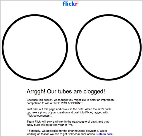
This has to be one of the most original error pages we have seen. Flickr turned it into a competition! Talk about distracting the user in a smart way.
Orkut
While not visually exciting, the error message is a classic.

Myspace
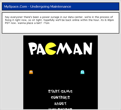
During one of its biggest service outages ever, MySpace did a brilliant thing: they put up a page with a playable Pacman game to keep people entertained.
Stumbleupon
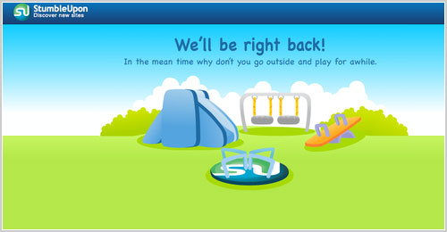
We don’t want to go outside… It’s RAINING. (We’re in Sweden.)
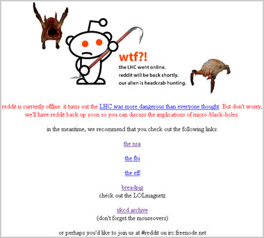
When all else fails, blame the Large Hadron Collider. 🙂
Ning
Showing pictures of your tech staff is always a great idea. Especially if they are fluffy animals.

The to-the-point ones
Typepad
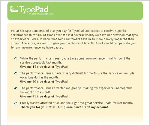
The error page is simple and to the point, but what is brilliant here is the second page below. It’s not an error page, but was set up after Typepad had experienced problems, letting users choose their own compensation. We wonder which option turned out to be the most popular? (If anyone from Six Apart is reading this, care to share that information with us?)

Hulu
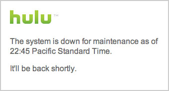
Hulu has clearly opted for keeping things simple.
Linkedin always brightens up their maintenance pages with their magician/gnome/elf (what IS that?), yet the message is professional and to the point.

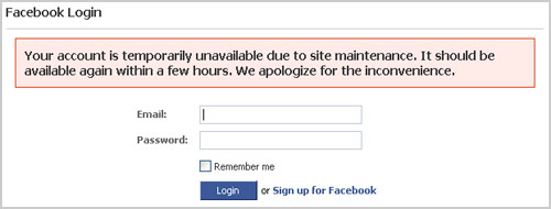
Another example of keeping things really simple. Perhaps a bit too simple.
Amazon
When money is involved, it might be best to avoid jokes.

Wikipedia
Wikipedia takes a very international approach… “Error” in 10+ languages.

Digg
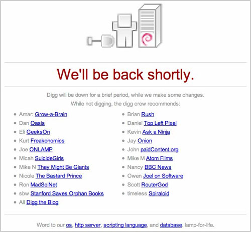
This is another classic error/maintenance page. Tipping the visitors about other cool sites in the meantime is a pretty neat thing.
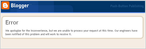
Blogger
Google’s Blogger service has a simple and to-the-point error message.
Netflix
Paying services may do well to stay away from jokes. Here is a nice example from Netflix (another one from Amazon above).

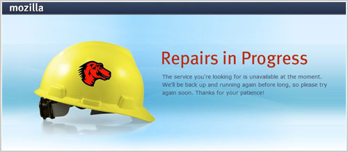
Mozilla
Polite and to the point, and visually pleasing.
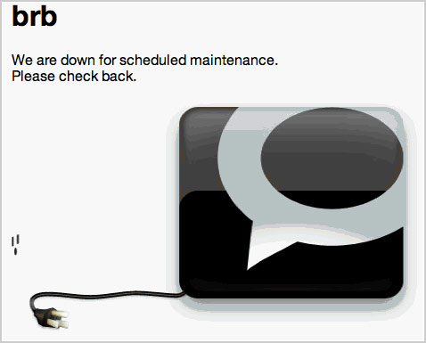
Technorati
We didn’t include the famous “oops, the technorati monster escaped” error message, but instead this maintenance page.
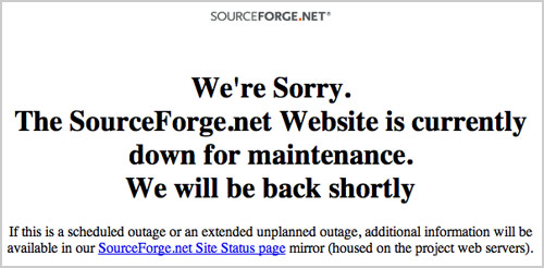
Sourceforge
Note the link to a status page. Always a good practice.
The non-existent ones
Microsoft Technet
Ok, this one can’t really be considered a Web 2.0 service, but we included it because this example shows more or less the worst case scenario. There simply is no custom error page present here at all.
![]()
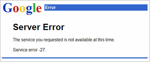
Google’s error pages are infamous for being uninformative. At least they have put their logo in there, but that’s about it. “Service error -27”? Ok…
Some advice about maintenance and error pages
The examples in this post are just a small sampling of the creativity (or in the last examples, lack of creativity) that companies have shown when setting up their maintenance and error pages. We hope you found them inspiring!
Counting on getting errors may seem a strange and counter-intuitive thing to do, but you might as well have a maintenance page ready for when you might need it, not to mention having a custom error page if your website suffers from an unexpected error.
Here are a few points that you might want to keep in mind when designing error and maintenance pages. Many of these may seem obvious, but if you’ve been around the Web for a while, you will have seen plenty of cases where this advice would have been needed.
- Keep an appropriate tone. Keep the tone in line with the service you provide. If you’re all about entertainment, entertain. If not, then maybe it might be a good idea to leave out the jokes.
- Be polite. You have just inconvenienced the visitor. Don’t make it worse.
- Don’t blame the user. Really. We have seen error pages that firmly state that the user did something wrong.
- Be informative. Let the user know what is going on and that you are doing something about it. If you know when the site will be back, let the user know.
- Provide up-to-date information. If you have a status page, link to it.
- Brand the page. It may be a simple error page, but at least include your logo so there is no doubt to the user what website he/she is on.
The advice above overlaps with a very specific kind of error page we have written about before, the 404 error page (page not found). You may want to check out these two posts for further inspiration:
- 17 brilliant 404 pages and why they are cool
- 23 percent of the top US websites have bad 404 error pages
Image sources:
Youtube, Mixx, Twitter, Yahoo Mail, Flickr, Orkut, Myspace, Stumbleupon, Reddit, Ning, Typepad, Typepad survey, Hulu, Linkedin, Facebook, Amazon, Wikipedia, Digg, Blogger, Netflix, Mozilla, Technorati, Sourceforge, MS Technet, Google.
